
Inspect Paint Colors from Any Reference Photo
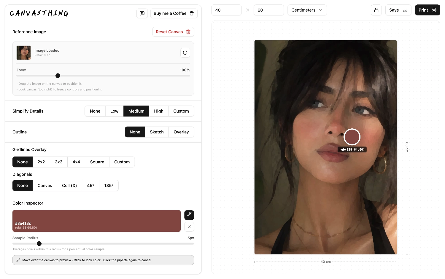
Pick any point on your reference photo to inspect and enlarge that exact color, then mix your own paint until it matches by eye. No ratios, no guesswork about brands or pigments. No accounts, no ads, completely free.
Sample Any Point
Click anywhere on your reference photo to pull the exact color at that point, no eyeballing against a busy background.
Enlarged & Isolated
See the sampled color on its own, at a size large enough to actually study and compare against your mixed paint.
Match by Eye
No ratios or recipes to trust blindly. Mix on your palette and adjust against the true color until it looks right.
Why We Don't Give You a Recipe
Most color-matching apps will tell you something like "60% cadmium red, 30% titanium white, 10% yellow ochre." It sounds precise. In practice, it rarely survives contact with your actual tube of paint, your actual brush, or your actual canvas.
Pigments vary between brands, mediums change how a color reads once dry, and "10%" of a small dab isn't something anyone measures in real life anyway. Canvasthing skips the false precision entirely. It shows you the true color, enlarged and isolated, and trusts your eye, which is already better at this than a formula, to do the matching.
What Typical Apps Do
Output a confident-sounding ratio for pigments you probably don't own, then leave you to figure out why your mix still looks off.
What Canvasthing Does
Shows you the color itself, clearly and at size, and lets you mix and compare with whatever paints you actually have on your palette.
How the Color Inspector Works
Three steps, and the same photo you're already painting or drawing from.
1. Pick a Point
Click anywhere on your reference photo, a shadow, a highlight, a small background detail, wherever you need a color from.
2. Inspect It Enlarged
The exact color appears enlarged on its own, so you can study it without the surrounding photo distorting how it looks.
3. Mix and Compare
Mix your paint on your palette next to the screen and adjust until the two colors look like a match to your eye.
Fewer Colors to Inspect, Not More Formulas to Follow
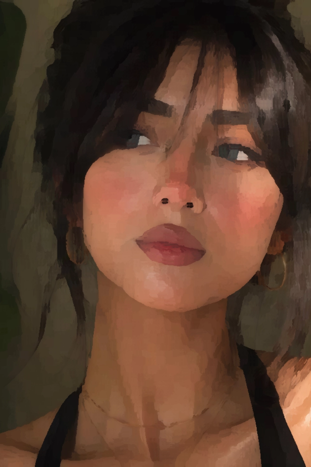
A busy reference photo can have hundreds of subtle color variations, more than you'll ever realistically mix on a palette. Run detail simplification first to abstract the photo into a handful of clean color blocks, then bring the color inspector in to sample each one directly. You end up mixing a deliberate palette instead of chasing every pixel.

Frequently Asked Questions
It lets you click any point on a reference photo and see that exact color enlarged on its own, separated from the colors around it. That isolation matters, because a color almost always looks different once it's surrounded by other colors, and your eye is the thing doing the actual matching, not a formula.